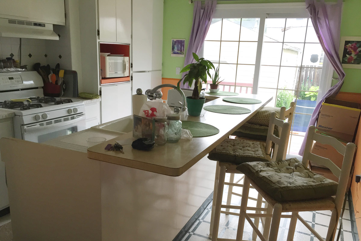
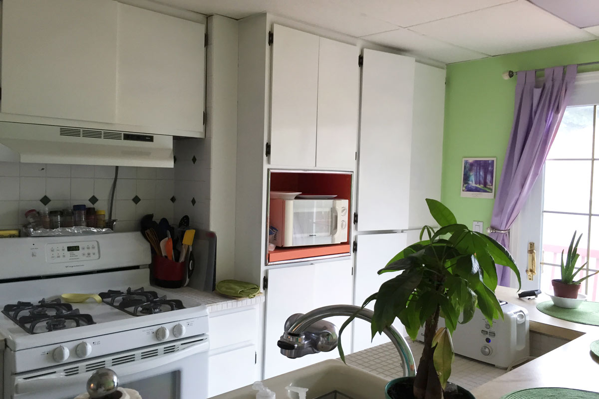
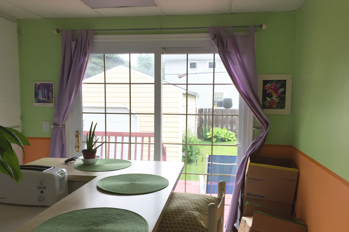
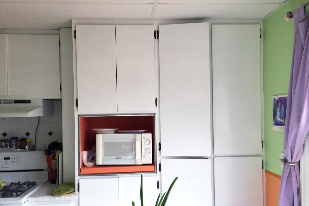
After a year of work, I finally have the time to document the house transformation, and the best way to start is with a collection of befores. Those of you following along on Instagram have likely already seen some teaser shots of the hot mess that was the Crystal Palace kitchen, but here it is in all its glory.
Good, Bad, Weird
Good
- lots of light
- large sliding doors to the deck
- white cabinets
- large size
- island
Bad
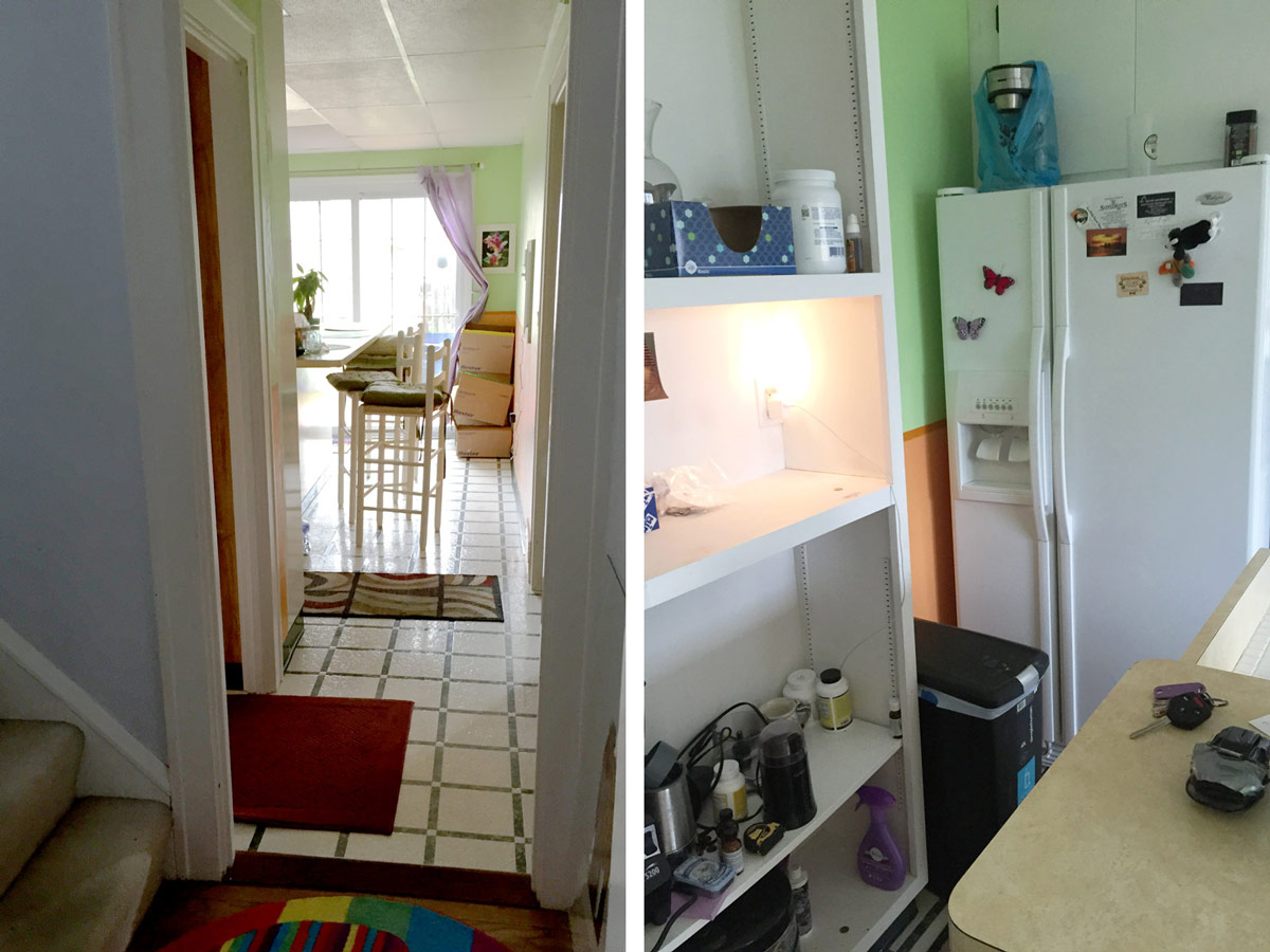
- unfortunate layout(my realtor referred to this layout as functionally obsolete)
- you can’t stand in front of the oven and open the door
- the island is too big
Weird
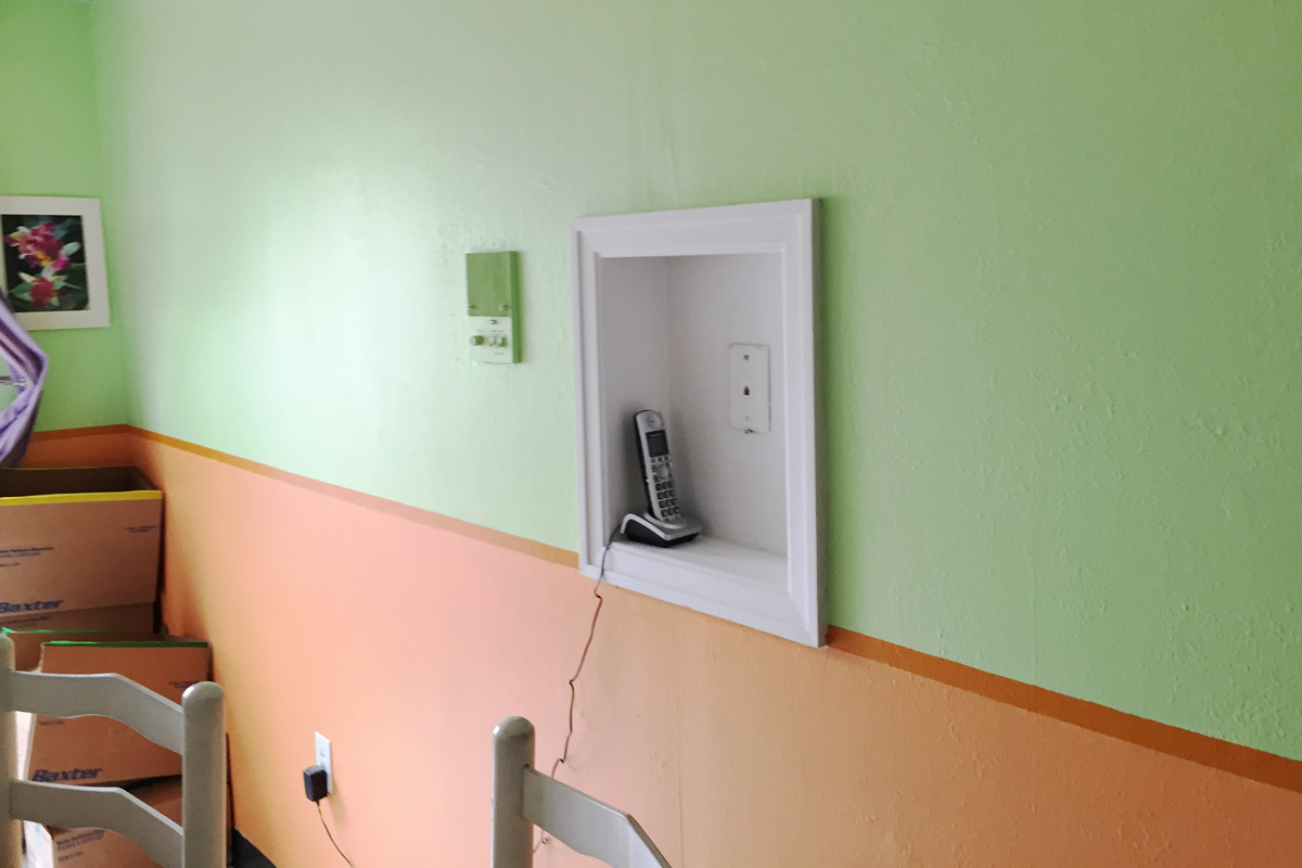
- hideous wall colors
- meh floors
- drop ceiling
- bizarre cabinet in front of the fridge
Immediate Plans
- remove the drop ceiling
- tear out the cabinet in front of the fridge
- get new bar stools
- paint over the neon vomit walls
Maybe Plans:
- replace the island counter with narrower wood planks
Future Plans
- scrap it and start over
Trying:
To look past the hideous colors and appreciate the large size of the kitchen.
What do you think? Does this kitchen look like such a trash heap that you would have passed by the house?
